Building a bilingual jewelry storefront with rentals and Razorpay
Bhagyalakshmi Future Gold: designing for wedding-shopper trust, Telugu as first-class content, and rental-led merchandising with Razorpay checkout.
the brief, before the long version
Client
Bhagyalakshmi Future Gold, a rental-first jewelry business serving wedding shoppers in a Telugu-speaking market.
Problem
The storefront had to feel trustworthy for high-stakes wedding purchases while handling catalog depth, rentals as the primary offer, and full English and Telugu support.
Role
Product design, front-end build, admin workflows, bilingual UX, and Razorpay-backed purchase flows.
Outcome
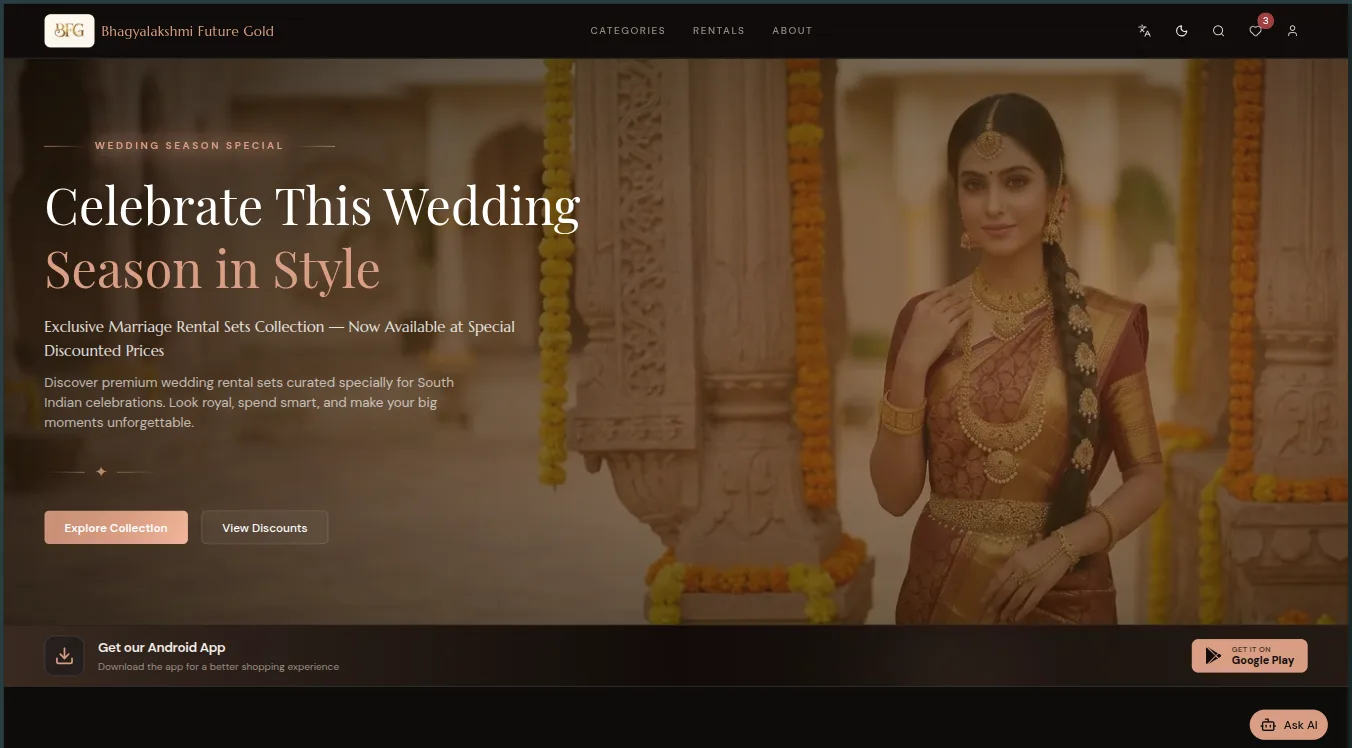
A polished storefront with English and Telugu support, rental-led merchandising, and cleaner purchase paths.
On this page
Bhagyalakshmi Future Gold is not a typical e-commerce client. Most of their customers are shopping for weddings, most of their business is rentals rather than sales, and a large share of their audience is more comfortable browsing in Telugu than in English. Each of those three facts breaks an assumption that off-the-shelf storefront templates quietly make. Together, they shaped the whole project.
This post walks through how I approached it: what the business actually needed, the decisions that mattered, and what I would tell anyone planning a storefront with similar constraints.
Wedding shoppers buy trust before they buy jewelry
A wedding purchase is high-stakes and emotionally loaded. Nobody casually adds bridal jewelry to a cart the way they would a phone case. Shoppers arrive skeptical, compare across stores, and involve the whole family in the decision.
That changed how I weighted the design work. Before any feature discussion, the storefront had to look and behave like a business you would trust with an important occasion: premium merchandising, consistent photography treatment, unambiguous pricing, and no dark patterns anywhere near the purchase flow. A storefront that feels cheap costs this business real revenue in a way that an analytics dashboard never would.
In practice that meant spending real design time on the catalog pages — the place comparison shoppers actually live — instead of only polishing the homepage. Catalog depth was itself a challenge: the inventory is large, so browsing needed strong category structure and filtering that holds up when a family is hunting for one specific style of necklace.
Bilingual UX is a content problem, not a translation problem
The most common way bilingual sites go wrong is treating the second language as an afterthought: build everything in English, then run the strings through translation. The result reads as foreign to the people it was meant to welcome.
For this project, Telugu was first-class. That decision has concrete technical consequences:
- The content model carries both languages. Product names, descriptions, and category labels exist in English and Telugu as real content fields, not as a translation layer bolted on top.
- Admin workflows enforce completeness. The team managing the catalog enters both languages when adding a product, so the Telugu experience never lags behind with untranslated gaps.
- Layouts are tested in both scripts. Telugu strings run longer than their English equivalents often enough that navigation, buttons, and cards all had to be checked in both languages, not just the one the designer speaks.
None of this is exotic engineering. It is mostly the discipline of deciding early that both languages matter equally, and letting that decision flow through the schema, the admin tools, and the QA pass.
Rentals invert the merchandising model
Standard e-commerce assumes you are selling objects that leave forever. A rental-first jewelry business works differently: the same piece serves many customers, availability matters as much as price, and the primary call to action is not “buy now.”
So the merchandising leads with rentals. Product presentation, category structure, and calls to action are built around the rental offer, with outright purchase as the secondary path rather than the default. Getting this hierarchy right was more important than any individual feature — it is the difference between a storefront that reflects the business and one that fights it.
Payments: Razorpay, and respecting the failure cases
Checkout runs on Razorpay, which is a good fit for an Indian business because it covers the payment methods customers actually use — UPI, cards, netbanking — behind one integration.
The integration work that matters is not the happy path. Razorpay’s checkout takes an afternoon to wire up; the real effort goes into the edges:
- Payments that are abandoned mid-checkout, so orders do not end up in a half-created state.
- Verifying payment outcomes server-side rather than trusting what the browser reports, so an order is only confirmed when the money movement actually is.
- Clear, calm error states in both languages when a payment fails — because a confusing failure message during a wedding purchase is how you lose a customer permanently.
This is a pattern I see across payment projects: the gateway choice matters less than how seriously the build treats the unhappy paths.
The admin side nobody sees
A storefront is only as good as the team’s ability to keep it current. Alongside the customer-facing build, the project included admin workflows for managing the catalog — products, categories, imagery, and both language variants — so the business can run the store without a developer in the loop.
The stack is Next.js with Supabase behind it and Tailwind CSS for the interface — deliberately boring choices that keep the site fast, the admin workflows straightforward, and the long-term maintenance cost low.
What shipped
The result is a polished bilingual storefront: English and Telugu throughout, rental-led merchandising, cleaner purchase paths, and an admin layer the team operates themselves. You can browse the live site to see it in practice.
If you are planning something similar
Three things I would carry into any comparable project:
- Name your real primary action first. If your business is rental-first, subscription-first, or quote-first, decide that before design starts — retrofitting it later touches every page.
- If a second language matters, put it in the schema. A translation layer bolted on at the end always shows.
- Budget payment work by its edge cases. The integration demo is quick; the trustworthy version is the actual project.
keep reading
More notes
Have a question or an interesting problem?
Feel free to send a note. Email is the fastest way to reach me.